
![]()
Quality is essential to success in a market as crowded as craft beer’s, where there are thousands of breweries and tens of thousands of brands for consumers to choose from. Disappoint consumers once and you’re not likely to get another chance to impress them. Good branding is essential, too, and label art is central to that. Few breweries in America have succeeded at this as well as Brooklyn Brewery. Then again, they’ve had an asset like no other.
Not long after founders Tom Potter and Steve Hindy had hatched their plan for a brewery in New York in the mid-1980s, they sought the help of The Bronx-born designer Milton Glaser in developing a logo. By that time, Glaser was already a heavy-weight designer known internationally. One of his first posters was in 1966 for Bob Dylan’s Greatest Hits. In 1977, he designed the I (Heart) NY logo, which has become iconic on a scale comparable to Nike’s swoosh or Apple’s logo. That logo seems simple and obvious to us now, but that’s only because it’s been recreated and mimicked countless times. Glaser, in his love for New York, gave the logo to the city and today, the city earns roughly $30 million from sales of products that display it.
It seems almost fantastical that Potter and Hindy were able to convince him to join forces with them, but after several phone calls spanning a number of months, Glaser agreed to meet them briefly. Presciently, Glaser told them to use the name “Brooklyn Brewery” because of its great name recognition and growing cultural cachet (a truth which still rings out today). Instead of a design fee, he asked for an equity stake… and free beer. We’d say that partnership has paid off in both directions! The Brooklyn Brewery “B” logo became one of the most recognizable in the industry.
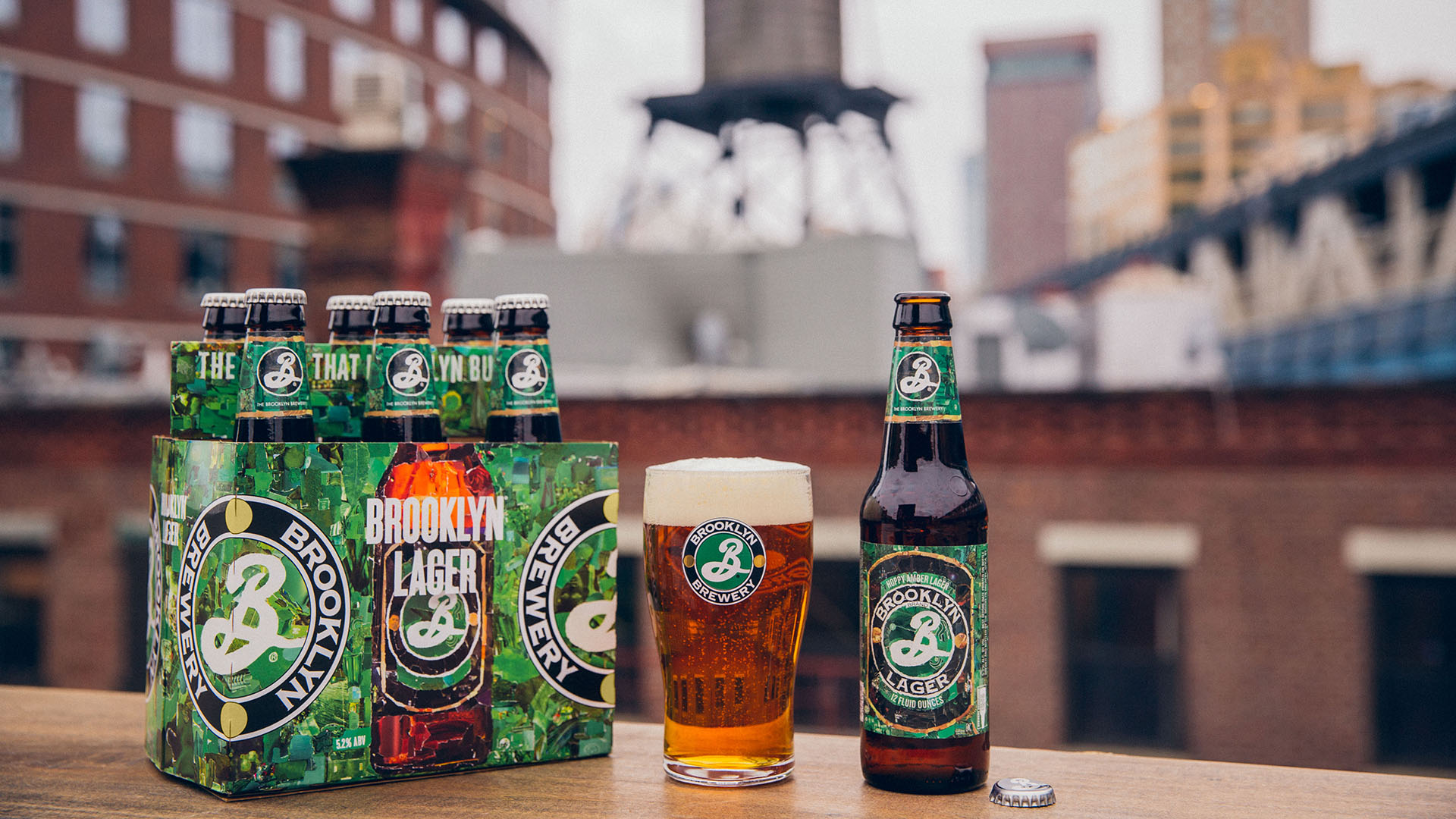
Although Glaser, now in his 90s, is still active, the brewery has also leaned on other designers in recent years. We wrote about this previously when discussing the Defender IPA package art with Brooklyn Brewery brewmaster Garrett Oliver. Recently, the brewery has released new package art for its core products. It’s not at all unusual for companies to update their art or logos as time goes by. Tastes change, after all. Given Brooklyn Brewery’s legacy in this context, though, it seems worth paying attention to what they unveil.
Many companies will alter their package design for export. This new art also appears on Brooklyn Brewery product in Japan, however. Ultimately, the market will respond to it, but we like what we see…
![]()


